Hellloooo Monday! I hope everyone had a wonderful weekend and stayed warm if you are anywhere but the west coast. We enjoyed sunshine and 60 degree weather. I even went for a run in shorts and a tank top on Saturday which felt so weird for the end of February. Huebie is off on a business trip this week so it’s just A and I. I’m looking forward to our fun traditions that we do when Daddy is gone. 🙂
I’m finally getting around to sharing our kitchen renovation with you! It’s only been 5 months since we finished the project, oops! I’ll blame it on the dreary fall and winter days and poor lighting. 🙂 I know you’ve caught glimpses in other photos, but I wanted to make sure and share the full meal deal.
I first started thinking about updating our kitchen back in 2013. I know, so long ago. So this project had been a long time coming. The main reason it came last October was because we were thinking about moving and wanted to make some changes to up our resale value. The move didn’t pan out, but I’m so glad it didn’t because I’m getting to enjoy the kitchen myself!
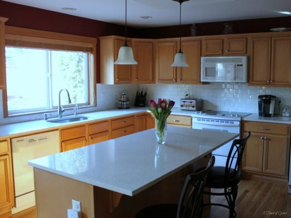
Our house faces north and is often dark, so I wanted to create a light and bright space for us to enjoy as a family. The previous counter tops and back splash were original from when the house was built in 1997. And they were dark. Dark green to be exact. Dark green laminate and dark green granite tile. All the dark green and wood cabinets made for a drab space.
Oh, I found a picture! Here is our kitchen before.
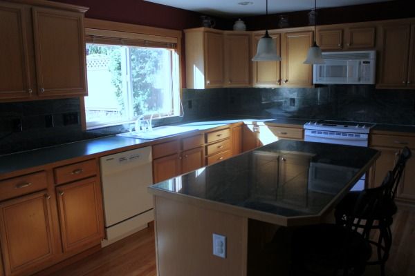
I know, so bad. It just always felt so dark. Even when the sun was shining.
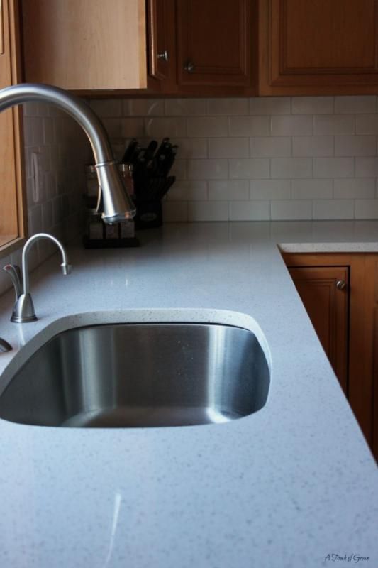
I’ve always wanted a white kitchen. To me a white kitchen is classic and always cheery. You can’t go wrong with white. We had a limited budget so we weren’t able to get new cabinets or reface them, but if we stay in the house I’d love to paint them white.
We chose white quartz counter tops and a white subway tile back splash. Quartz is the most durable stone of all the options out there. It’s man-made so you don’t have the unexpected lines and interesting imperfections like with granite, but you really can’t tell the difference. The quartz is from Pental Granite & Marble and the subway tile is from Home Depot. I love the classic lines of the subway tile. We did a really light gray grout to add some contrast to all the white. It’s called Platinum at Home Depot.
We also put new hardware on all the drawers and cabinets right before we demoed the old counters and back splash. There were previously no pulls and I feel like drawer and cabinet pulls make the kitchen look more finished and polished.
I love everything about the kitchen but I think my favorite thing is the sink.
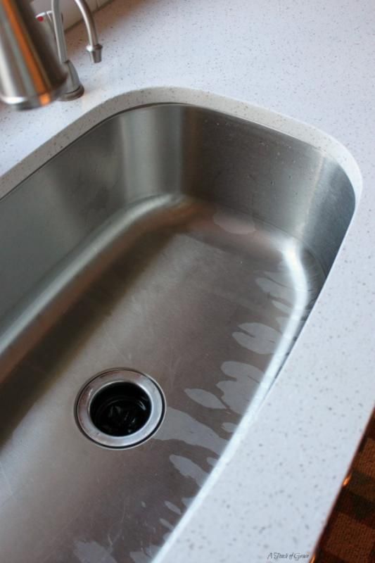
It is huge! It’s so deep and you can fit pots and pans in there to soak. Our last sink was a double sink and some of my pans wouldn’t fit so you’d end up with a pan half soaking/half sticking out of the sink. I hadn’t seen the sink in person before we ordered it (just a rendering) so I was really nervous it was going to be small. But it is so much larger in person.
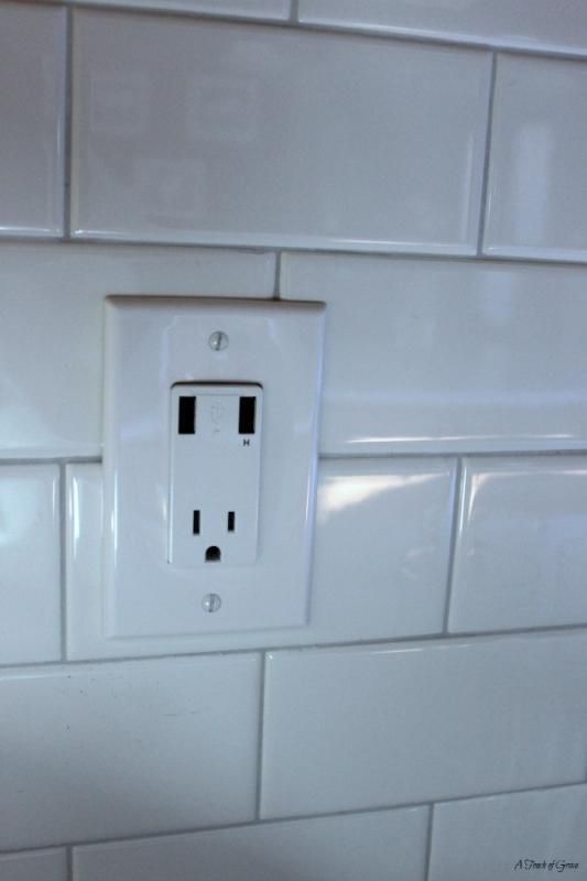
Huebie also installed a USB outlet! This is seriously the most amazing thing ever.

We also made a little coffee station area that fits our Keurig and K-cups perfectly. I love walking over to this little space first thing in the morning. And that little jar holds a surprisingly large amount of K-cups.
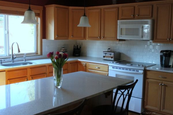
We will eventually get around to painting the red that is above the cabinets and on the wall behind the island. I’m thinking something a very pale green/blue. I’m not 100% sure yet but it will definitely be something to complement the white cabinets and counter tops.
The one thing we really want to eventually do is purchase new stainless steel appliances. The appliances are also original to the house and still going strong so we figured we’d wait. The white doesn’t bother me as much as it used to, now that the kitchen is lighter and brighter.
Have a great Monday love bugs!



LOVE the subway tile, it’s my favourite! It really does brighten up the kitchen, add a brighter paint and you will be golden! 🙂
How gorgeous! I absolutely love it.
Wow! I’d never seen a photo of what it looked like before. The white REALLY does brighten it up. I love your kitchen and now have great memories from standing in that kitchen – enjoying wine, cheese and conversation 🙂 (oh! and that candied smoked salmon,…yum!) That was one of my favorite meals ever! :-p
Absolutely love how much brighter it is and your island is my favorite part! xo, Biana – BlovedBoston
It looks great! The lighter colored back splash and counters, really lightened it up. If I was rebuilding, my kitchen would be white. I love white kitchens!
You guys did an amazing job– just changing the countertops made such a huge difference in the amount of light in the space! I love how light and fresh it looks with the cabinet color even though you eventually want to change them to white. And I’m literally swooning over your sink!
Looks great!! I live the white countertop! Definitely lightens up the room!!! And, that USB port….I wish we put those in our house when we built it!!
I’ve never seen those USB outlets before. What a great idea! Your kitchen looks great. Everything you updated looks amazing.
Ahhhh, I LOVE it Tiffany!!! SUCH a difference! It really brightens the spaces and majorly updates it. I love the way the subway tile glitters in light, so gorgeous. And that sink, I need that. Also the usb plug-ins!!! How useful! Now you have me dreaming of a kitchen makeover too. I want to repaint mine, paint the pantry door, update the lighting, put a backsplash, add hardware….phew lol, I have a long ways to go obviously! Thanks for sharing your beautiful kitchen with us! And I hope you and Little A have a great week doing your traditions together while Huebie is away <3
What a difference a lighter counter and back splash makes! We have subway tile in our kitchen too… it’s kind of a tan glass. I knew when we were doing kitchen renos, that I wanted subway tile… so glad we got it.
I want a USB plug-in too! Genius!
Thanks for sharing! You’re kitchen is gorgeous.
xoxo
Looooove this! I watch that “love it or list it” show and always think HOW can someone list their house after making super cool changes! I love that you’re getting to enjoy the kitchen yourself!
So pretty!!!!!! I love your big sink…..it seriously made my heart flutter especially with my new sink arrangement that can barely fit one pot in it and then the water gets all over me when I’m doing dishes……I definitely have kitchens dreams 😉
Hunter green, for the 1990’s win!! The quartz is much, much better. It’s funny how one simple update can change the whole look of the place, isn’t it? Love these home posts as we start to put our own stamp on our new place!
Love Love! USB outlet! WAHOO! I love that idea too. Looks great!
The USB outlet is amazing! Seriously so functional!
Wow, I love this! And I think it’s amazing how much of a difference it made to just redo the backsplash and countertop. We redid the same things in our kitchen several years ago and hubby wanted to go with subway tile, and I did not- and I won. 🙂 Thing is, I’ve been kicking myself ever since! I love the classic, clean look of white subway tile and I know our kitchen would way better if we had gone with that.
Can’t imagine how much brighter it will be once you repaint!
Beautiful and awesome!! I love that sink! It’s my favorite type of sink. Small sinks or the sink that is divided in the middle, drive me nuts. I have the type of sink that drives me nuts, lol. Sigh! Also, one of my dreams is to have an all white kitchen. I love white kitchens so much too. Very pretty!